COLOUR POWER:The Role of Colour in Fashion and Design
COLOUR POWER
The Role of Colour in Fashion and Design 

DESIGNER & COLOUR
How Designers Choose the Perfect Palette – And Why It Matters to You
Have you ever tried on an outfit and felt instantly alive? Or the opposite—looked in the mirror and felt like something was missing?
Let me tell you a secret: it’s not just the cut or the fabric—it’s the color. 
As a textile and fashion designer who works deeply with prints and palettes, I can tell you that color is never an afterthought. It’s a design decision that can completely shift how you feel, how you’re seen, and even how you carry yourself. That’s the power of color in fashion.
COLOUR IN FASHION
 Why Color Is Everything in Design
Color does more than make an outfit look “nice.”
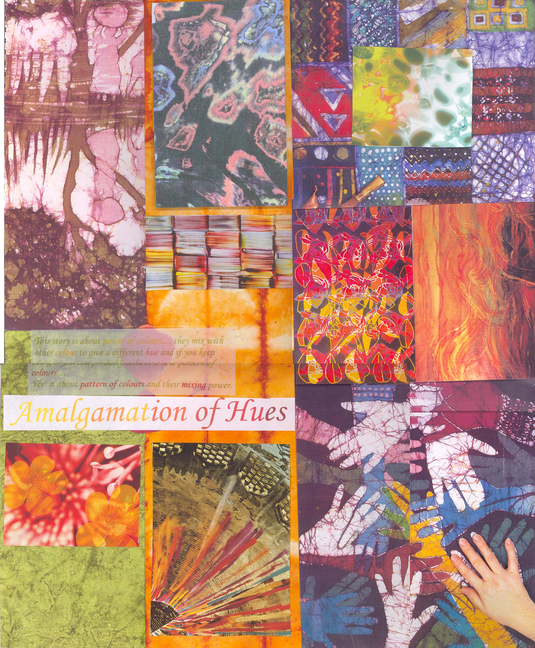
It sets the tone, evokes emotion, and creates identity. As designers, we don’t randomly pick shades from a chart—we choose each hue with intention. Because every color tells a story. Understanding of colour wheel acts as a compass for a designer to understand which colors complement,contrast, or clash.
"The Psychology of Color:Emotions in Every Shade"
Colors are emotional. And fashion, at its best, is about emotion.
Here’s how we think about color when creating a collection:
Bright colors:
Deep tones:
Neutrals :
like beige, white, black, grey) offer grounding. They’re timeless, letting prints, shapes, or accessories take center stage.


The Power of Palette: In Print & Design
In print design, color is what makes or breaks the design. Whether you’re working with simple motifs or layered textures, the final impact depends heavily on the color palette—be it bright, dark, warm, or cool. The way colors come together can completely change how a design feels and how it’s received. That’s why choosing the right palette isn’t just an artistic choice—it’s a strategic one.

It needs to resonate with the target audience, reflect regional preferences, and align with the market you’re designing for. In fact, color is often one of the biggest reasons a print sells well—or doesn’t—in a particular country or cultural context.
The right colors can balance a busy print, add richness to a minimal one, or completely transform an average design into something fresh and desirable.
In print, color isn’t just a visual element—it’s the emotional core and commercial driver.
A PERFECT PALETTE : DESIGNER APPROACH
Color Isn’t Just Aesthetic. It’s Strategy
 As a designer, I also think about:
Emotional impact ,Brand identity ,Target audience ,Current fashion trends ,Fabric and texture interactions.
THE FUTURE OF COLOUR IS DIGITAL `
Digital tools have transformed how we work with color.It also opens up endless possibilities—with design software, a single print can be explored in multiple colorways, quickly adapted to different moods, seasons, or markets. What once took days of sampling can now be tested in minutes.
Digitally, color becomes more than a choice—it becomes a dynamic tool for innovation, speed, and creative freedom. It extends the life of a design and deepens its impact, proving once again that color is one of the most powerful assets in modern fashion.
You’re telling the world who you are, how you feel, and what you stand for.

*Saree and Stoles in the images are by Ihkar from our website www.ihkar.com